
You've seen it happen: a beautifully designed Webflow site gets undermined by inconsistent formatting, awkward spacing, or blog posts that just don't read right once they're live. It's frustrating. Whether you're vetting a publishing pipeline, troubleshooting a CMS integration, or comparing tools ahead of a company rollout, getting the content look right in 2026 means understanding how structure, design, and automation intersect long before anything goes live. This guide breaks down exactly what that takes.
What Do We Mean by the 'Content Look' of a Website
Content Look vs Content Strategy
People mix these up constantly. Content strategy is the planning layer — what topics you cover, how often you publish, who you're writing for. Content look is what happens after that plan turns into a page: the structure, formatting, visual hierarchy, and tone that shape how a reader actually experiences the words. You can have a brilliant editorial calendar and still lose readers because paragraphs run twelve lines long with no air between them. A solid grounding in the introduction to content discipline makes clear that structure and strategy are separate jobs, even though they get treated as one thing far too often.
It's also not the same as visual design or UI. A designer might nail the color palette, the nav bar, the button states — and the actual article beneath all that chrome still reads like a wall of text. Content look sits in the space between design and copy: font size, line spacing, subheading frequency, how scannable a piece is at a glance. Think of it as the typography and layout choices that live inside the content itself, not around it.
Why First Impressions Drive Bounce Rate
Editorial and creative outlets obsess over this for good reason. A reader lands on an article about illustration or photography and decides, in about three seconds, whether the page looks trustworthy. That judgment happens before a single sentence gets read. It's driven by whitespace, paragraph length, and whether the page feels organized. Publishers whose credibility depends on craft can't afford a sloppy layout undercutting a well-reported story.
Bounce rate is the blunt instrument that measures this failure. If a page looks dense or chaotic, people leave — often before finishing paragraph one. That's true whether you're running a design magazine or a local service site. Learning more about who's behind a publication, the kind of detail you'd find on an about page, only matters once the layout has earned enough trust to keep someone reading that far. Everything from here forward in this guide builds a practical framework for getting that first impression right.
Core Elements That Shape How a Page Reads
Typography and Hierarchy Basics
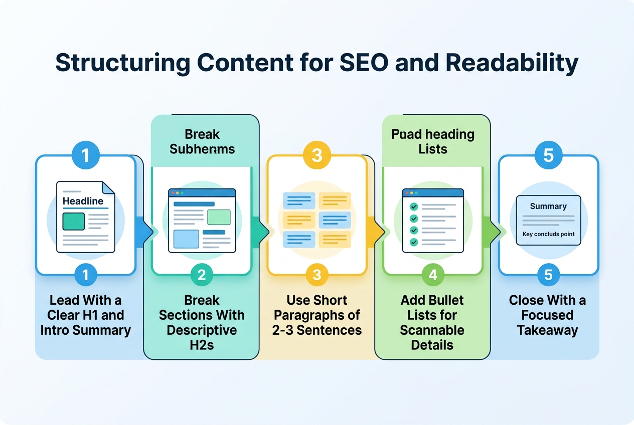
Before you touch color palettes or imagery, look at the bones of the page: the type. Heading hierarchy isn't decoration. An H1 tells readers and search engines what the page is about, H2s mark the major sections, and H3s handle the finer breakdowns underneath. Skip a level, or use headings just to make text bigger, and you confuse both a crawler and a human skimming on their phone. Google has said as much when discussing making visual content more useful in Search, and the same logic extends to how structured text gets understood and ranked.
Once the hierarchy is set, spacing does the rest of the work. Long unbroken paragraphs kill momentum. White space gives the eye somewhere to rest, and tight line spacing makes even good writing feel like a wall of text. A few habits separate pages people finish from pages people abandon:
- Keep most paragraphs to three or four sentences so the page never feels like a slab of text staring back at you
- Use bold sparingly on the one phrase per paragraph that actually carries the point, not every phrase that feels important at the time
- Break up longer features with pull quotes that give readers a breather and a reason to keep scrolling
- Add callout boxes for tips, warnings, or stats that deserve to stand apart from the main narrative
- Set line spacing generously, around 1.5 to 1.6, so lines of text don't blur together on smaller screens
Consistency matters as much as any single rule. If one category on a site reads casual and punchy while another feels stiff and corporate, readers notice, even if they can't name why. Many local businesses run into this when different writers touch different sections without a shared style guide. It's the same reason a content creation agency will insist on a documented voice before scaling output, and it's a smart habit to borrow. Try running a style pass with something like dev fixture keyword 1 to catch drift early.

Structuring Content for SEO Without Sacrificing Readability
Search engines see your title tag and meta description before any human does. That's the real first impression, not your hero image. Get those two lines wrong and nobody clicks through to see the rest of your content look work. Keep the title tag under 60 characters, the meta description under 155, and make sure both actually describe what's on the page instead of just stuffing in target keywords.
On-Page SEO Checklist
Every page needs exactly one H1, and it should match the page's actual subject, not a generic label. A photography feature titled "Street Photography in Bushwick" shouldn't carry an H1 that just says "Blog." Beyond that, there's a short list of checks worth running before anything publishes. The table below covers the essentials.
| Element | Rule | Common Mistake |
|---|---|---|
| Title tag | 50–60 characters, keyword near the front | Stuffed with three keyword variants |
| Meta description | 140–155 characters, includes a reason to click | Left blank, so Google auto-generates it |
| H1 | One per page, matches topic | Multiple H1s or a mismatched label |
| Body keyword use | Natural mentions in intro, one subhead, conclusion | Same phrase repeated every other sentence |
| Image alt text | Describes the image, includes keyword only if relevant | Alt text left empty or keyword-stuffed |
Note that alt text and licensing go hand in hand. Before you publish anything with sourced photography, reviewing image license info saves you from takedown headaches later.
Internal Linking Patterns
Good internal linking connects an illustration feature to a related graphic design piece, or a photography article to an architecture one covering similar visual themes. Three to five contextual links per article is a reasonable target. Don't force them. And when you're unsure what's fair game to link or quote, Content policies for Google Search lays out the boundaries clearly.
Writing Content People Actually Finish Reading
Great design won't save an article that wastes the reader's time. Most people scan the first two sentences and decide whether to keep going. Lead with the point, not the throat-clearing. If your best insight is buried in paragraph six, move it up. Nobody's rewarded for patience anymore. They're rewarded for finding what they need fast.
Questions to Ask Before Publishing
Before anything goes live, sit with a few honest questions. Skipping this step is how you end up with content that reads fine but helps no one.
- Who is this piece actually written for, and would that person recognize themselves in the first paragraph?
- What specific problem does it solve, and could you state that problem in a single sentence?
- Is there a faster way to deliver the same value, cutting sections that exist just to pad word count?
- Would a smart search feature surface this page for the right query, or is the framing too vague?
- Does the piece say something the reader couldn't get from a five-second search elsewhere?
Editing for Clarity
Clarity is mostly a rhythm problem. Long, uniform sentences lull readers into skimming, then losing the thread entirely. Mix it up: a short sentence here, a longer one there that actually earns its length. Cut jargon unless your audience lives and breathes it. And match your tone to who's reading — a piece for creative culture fans should feel looser than one written for technical SEO practitioners comparing integrations. Because on-site search shapes how visitors experience your existing content, exploring smarter site search tools is worth the time for teams serious about retention. Read your draft out loud once before publishing. If you stumble, so will they.
Designing for Accessibility and Web Standards
Accessibility isn't a nice-to-have anymore. It's part of what a page's content look actually means, whether you're editing a piece on mid-century architecture or a photo essay shot on 35mm. Search engines reward structured, well-labeled content, and readers using screen readers or slower connections depend on it entirely. When you're checking a CMS-driven article before it goes live, spending time on how a single item's fields render — headline, body, media, metadata — pays off. Reviewing something like how a content item is structured behind the scenes can clarify why these fields matter so much for consistency at scale.
A handful of habits make the biggest difference, and most take just a few extra minutes per article.
- Give every article a descriptive, unique page title that tells both readers and search engines what the piece actually covers, rather than a generic label repeated across the site.
- Write link text that names the destination or action — "read our illustration submission guidelines" beats a lonely "click here" every time.
- Add alt text to every image, especially in photography and illustration features where the visual is the whole point, not an afterthought.
- Include captions and transcripts for any video or audio embed, since not every reader can or wants to hit play.
- Write instructions in plain language — short sentences, no jargon — so a newsletter signup or contributor form doesn't confuse anyone.
- Test your heading structure with a screen reader occasionally; it exposes gaps a visual scan never will.
None of this is glamorous work. But skip it, and you're quietly locking out a chunk of your audience — plus telling search engines your content is harder to trust.
Balancing Text, Images, and Video in an Article
Every visual format asks something different of a reader and of you. A photo pulls people in fast but says little on its own. Video builds trust and holds attention longer, though it takes real time to shoot and edit. Infographics sit in between: quick to scan, slower to produce well. Knowing the tradeoffs matters more than picking a favorite.
| Format | Engagement Level | Load Time Impact | Production Effort |
|---|---|---|---|
| Static image | Moderate, fast attention grab | Low if compressed properly | Low to medium |
| Photo gallery | High for visual subjects | Moderate, depends on lazy loading | Medium |
| Embedded video | Highest, longer dwell time | Low if hosted externally | High |
| Infographic | High for data-heavy topics | Moderate, larger file sizes | Medium to high |
For a photography feature, a gallery does more work than any single hero shot. Let the images breathe and speak for themselves. Animation coverage, on the other hand, almost demands embedded video since motion is the whole point of the medium. A screenshot just can't carry that story.
As a rough rule, aim for one visual element per 200-300 words of body text. That's roughly three to five images, or one video plus a couple of photos, in a 1,000-word piece. Fewer than that and the page feels dense. More, and it starts to feel like a slideshow with captions.
Optimization basics still trip people up constantly. Keep images under 200KB where possible, write alt tags that actually describe the scene, and use filenames like "brooklyn-illustrator-studio.jpg" instead of "IMG_2044.jpg." Building this into a repeatable checklist, the kind covered in solid content strategy tips and tricks, saves a lot of cleanup later. Most people skip this step. It shows.
Auditing and Maintaining a Consistent Content Look Over Time
Building an Editorial Checklist
Every editor needs a checklist before hitting publish. Not a vague style guide nobody reads, but a short, specific list: header hierarchy correct, image alt text filled in, internal links working, byline and category tags set, meta description written. If you're managing a team of contributors publishing across animation, illustration, and photography beats, the checklist is what keeps five different writers producing pages that still look like they belong to the same publication.
Revisiting the fundamentals occasionally helps too. Anyone building this process from scratch should spend time learning what a website's content should look like before locking a checklist in place, since it's easy to standardize the wrong habits early and drag them forward for years. A ten-minute review catches most of that.
Keep the checklist short. Ten items, maybe twelve. Longer than that and people start skipping steps, which defeats the point entirely.
Navigation and Findability
Old articles rot quietly. Formatting standards shift, embed codes break, and a photography feature from three years ago might still be running an outdated image module that no longer renders on mobile. Set a recurring audit — quarterly is reasonable — and pull a sample of older posts to check for broken structure, dead links, and layouts that no longer match current templates.
A sitemap and clean category navigation matter just as much as the writing itself. A reader hunting for architecture coverage shouldn't stumble through graphic design posts to find it. Clear taxonomy, logical URL structure, and a sitemap that search engines can actually crawl all reinforce the same consistent structure readers come to expect. Newsletters do quiet work here too, reinforcing tone and pulling repeat visits week after week. Someone has to own it, though. Assign a managing editor to enforce standards, or the whole system slowly drifts.
If you're curious to see this content look in action, swing by RankPush Test Blog, the Brooklyn-based magazine covering design and creative culture from its home at 144 N 7th St. #536 in Williamsburg. Their team of editors and writers covers everything from illustration to product design, and it's worth exploring their archives or subscribing to the newsletter to see how thoughtful visual storytelling comes together. Feel free to reach out to their contributors channel if you'd like to get involved.